SBNC Logo

Brainstorming Rules for Design Thinking

Defer Judgment

No idea is too wild - criticism comes later

Encourage Wild Ideas

Unusual ideas can spark practical solutions

Build on Ideas of Others

Use "Yes, and..." instead of "Yes, but..."

Stay Focused on Topic

Keep discussions tied to the challenge at hand

One Conversation at a Time

Everyone's voice matters - listen actively

Go for Quantity

More ideas increase chances of finding great ones

Be Visual

Sketch, diagram, use sticky notes - whatever helps

Dream Without Limits

Don't limit ideas to what you think is possible - go wild! Let the engineers and physicists deal with limitations
Priority Page #1: Events Calendar

Busy Professional
Active Volunteer
Participant Member
Events Calendar
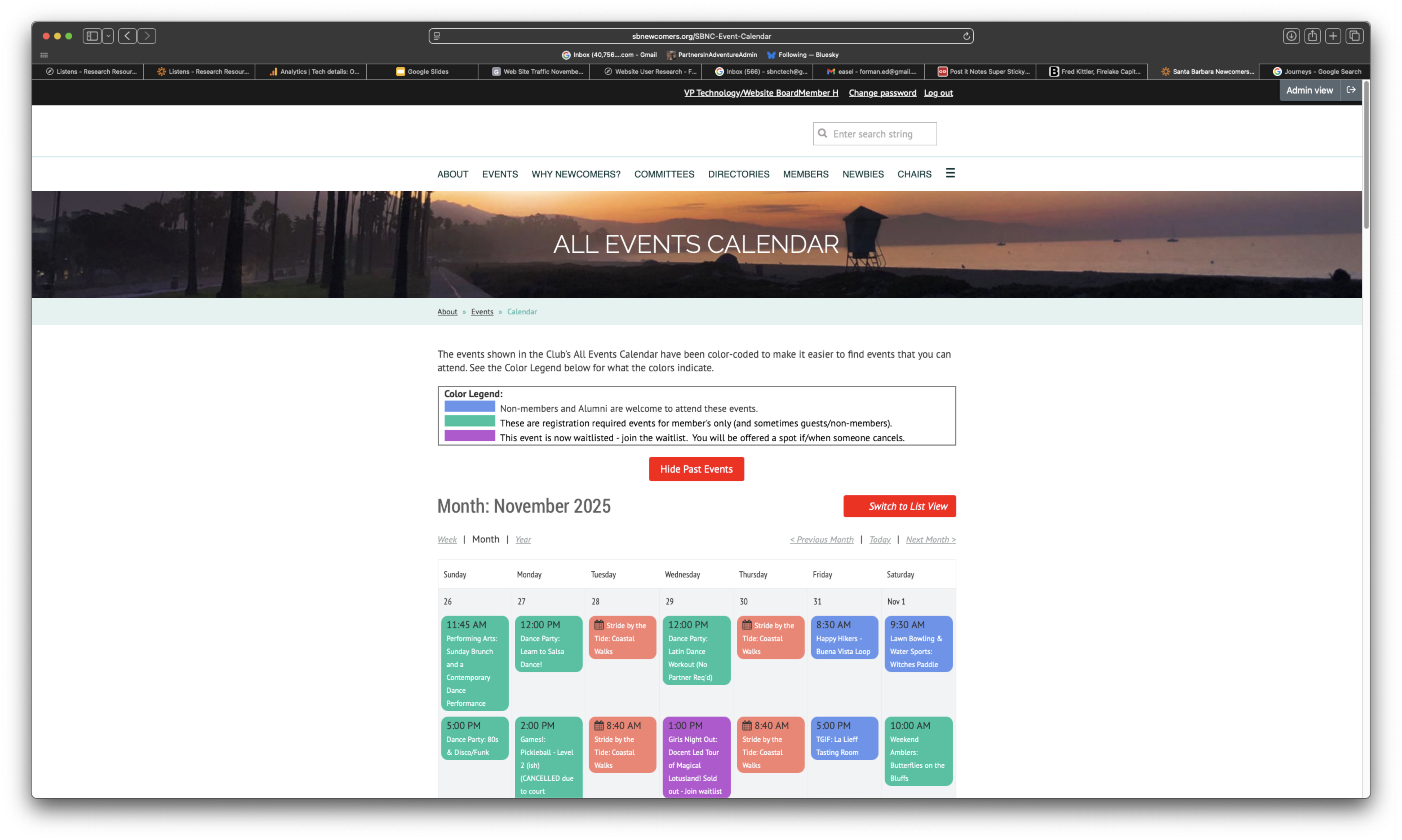
The events tab is all that I use. I go to that link and that's the only thing I use on the website.
I think it would be helpful to know which events still have openings or have it blocked out or something like that.
I noticed the app has a search bar, a search field and you can put in a keyword and it'll bring up that but on the website, it doesn't.
When I'm scrolling through the calendar on the website you have to go back to the top in order to go to the next month.
Sometimes it'll be like a hold the date or that it'll be. Oh, it's registration full but then there's no names.
It would be easier if you could pick whatever committee that you think or see what they have.
It was easy to find events and easy to sort events.
Having a calendar would be very, very helpful and it doesn't seem inviting to me.

Priority Page #2: Member Dashboard

Busy Professional
Active Volunteer
Participant Member
Member Dashboard
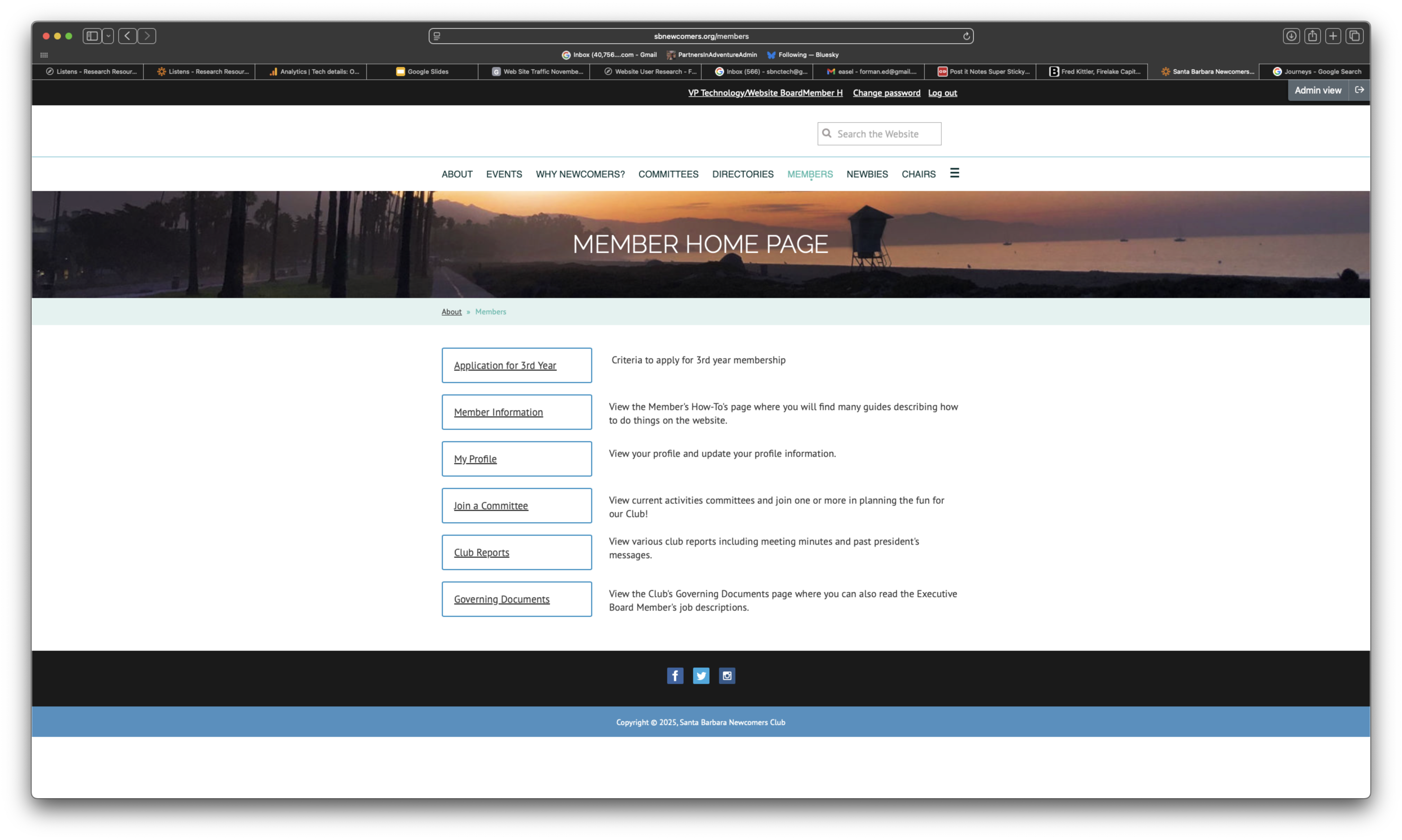
I look at my emails to see what I've signed up for.
I haven't figured out where to find what things that I've signed up for on the website.
You have to go to your profile, then you have to go to the member page, then you could then find My Event Registrations.
I've never even been here—I've been in it three years but never seen this part.
It's like super easy to do on the app but really hidden on the website.
People wanted their address changed and just didn't know how to do it.
There's quite a bit on that page that really isn't something that people are that familiar with.
The member page could stand to have your account be one of the main things on the front page.

Priority Page #3: Homepage

Busy Professional
Active Volunteer
Participant Member
Homepage
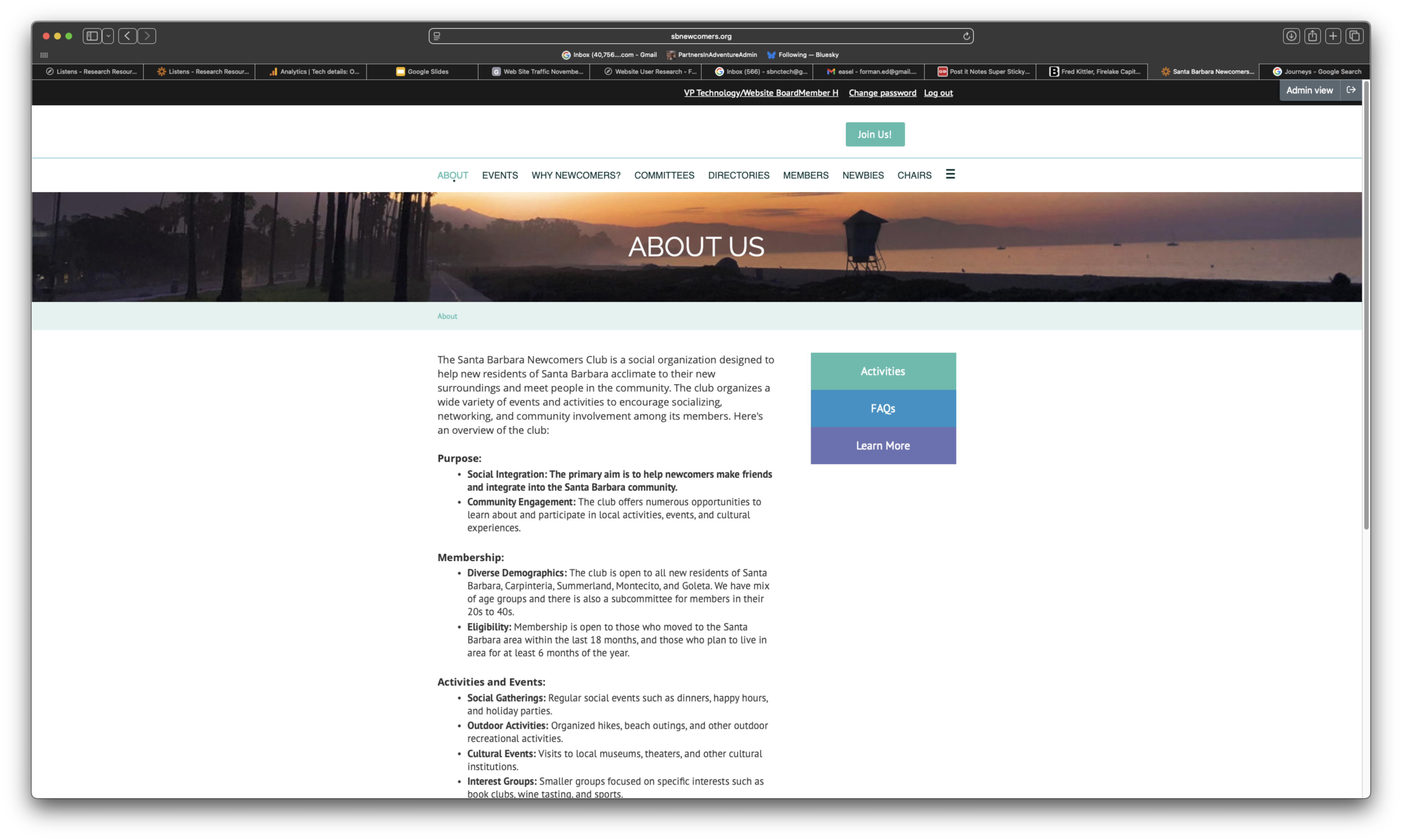
The website appears very dated.
The homepage looks like you're starting either a surfing club or a lifeguarding club.
The color scheme is not very inviting or exciting.
Not having a header at the top saying it was the Santa Barbara newcomers, you could mistake it for another website.
Have pictures showing the Santa Barbara newcomers sign or the logo.
I don't know if it's a good idea to have your member exclusive events and then have a listing of things that are canceled.
There's a lot of information and people are going to see it, glaze over it and maybe not go deep into where you want them to go.

Priority Page #4: Committees/Groups Directory

Busy Professional
Active Volunteer
Participant Member
Committees Directory
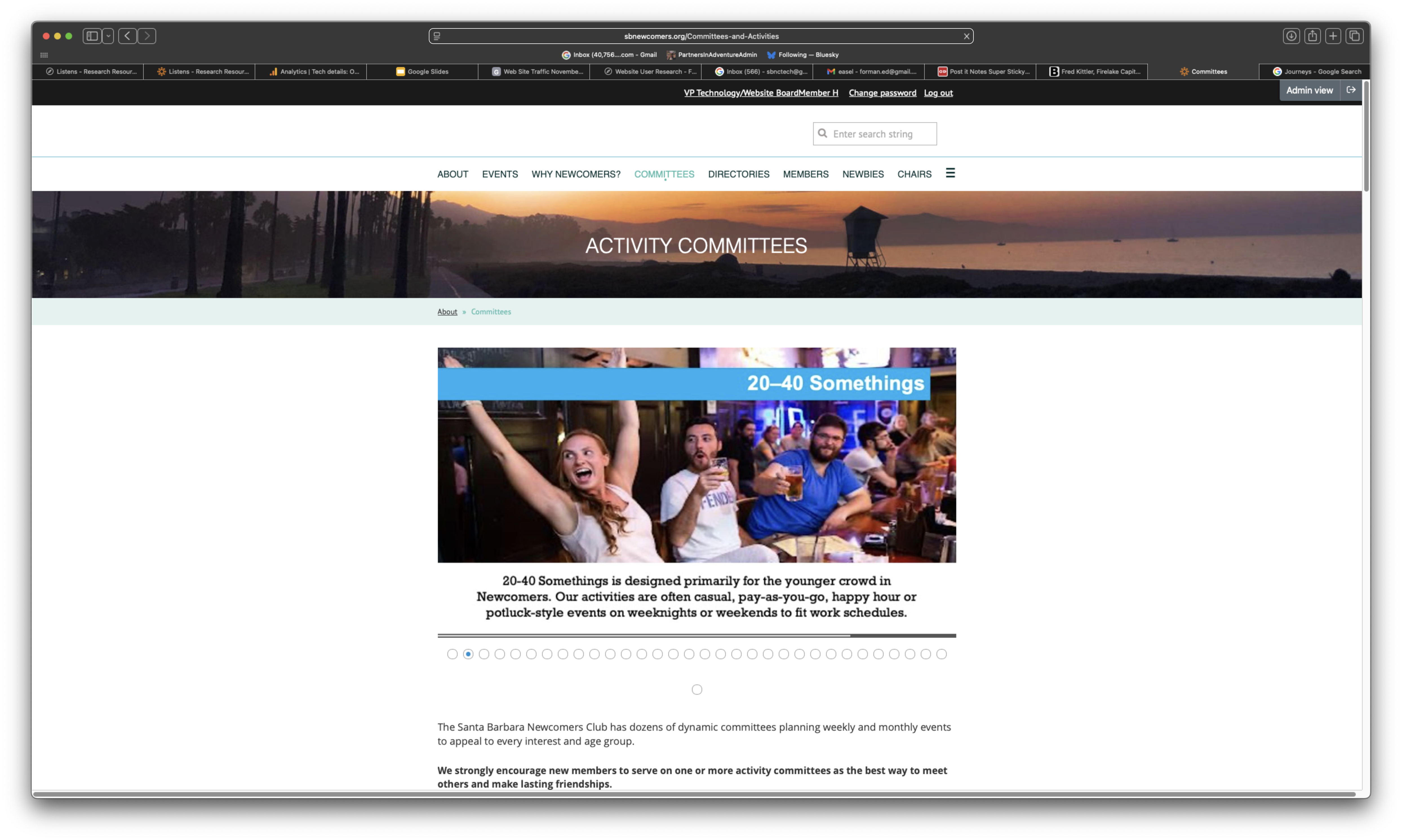
I was not aware of the 20 to 40 somethings committee.
The descriptions weren't clear to me and it really didn't come across as exactly what it was.
Once you get to the actual committees list, it's super helpful because the info I need is right here.
Finding those board member descriptions, it's not so obvious.
The heading, the activity committees, takes up a huge bar and the photo takes up so much space, so you have to scroll all the way down to find the names of the committees.
There's way too many revolving tiles on the activities page—you're never going to make it through all of those.
How do they find each other after they're done?

Priority Page #5: Main Navigation

Busy Professional
Active Volunteer
Participant Member
Main Navigation
I feel like I have to go back a lot more steps that way than with the app.
There's only two items in the hamburger menu and then there's seven top tier items, which is a lot.
You have to click through a few different buttons to get to the calendar.
It took a while before I even saw the page with the house logo come up—that's a navigational glitch.
Governing Documents is at the very bottom tab on that page, so that isn't all that visible.
It's under Governing Documents which you wouldn't necessarily look for.
The chair tab is the same—just a list of links that's not visually engaging and doesn't bring a lot of contextual information.

SBNC Visual Branding & Design Feedback

Busy Professional
Active Volunteer
Participant Member
SBNC Logo
It feels very dated. The website appears very dated. When I first looked at it, not having a header at the top saying that it was the Santa Barbara newcomers, you could mistake it for another website here in Santa Barbara.
The color scheme is not very inviting or exciting either way. You're using basic font, using bold to highlight. I think you could be using much newer or more innovative ways to get people's attention.
It looks like something that was kind of put together, and I don't want to offend anyone, but it looks like something that was very simply put together and not intended to be drawing individuals into something.
I think the way it looks right now with just a white background, with the white text boxes, the black font, it's just not very inviting.
I'm not as wowed and impressed by the latest little wrinkle or cosmetic—is the color right, is the font right? That kind of stuff. I'm looking for utility.
And so from that perspective, cleaner, simpler, better is my approach.
It's not super pretty or anything like that, but it's not bad. It's just...I don't know. I don't have any suggestions for that really.
Well, I'm not sure we really need to sell people on this proposition, because we already know we want to join because we want to meet people. But the website needs to be prettied up a little bit just to be more attractive.
Just doesn't look inviting. Again, it's got the same kind of blandness that the website has.
The homepage looks like you're starting either a surfing club or a lifeguarding club. I think you need to be way more specific or have pictures showing the events that you're doing, have pictures showing the Santa Barbara newcomers sign or the logo.

SBNC Brand Identity

Who Are We?

Design Thinking Workshop - November 18, 2025

SBNC Brand in Music

Which voice represents who we are?
Listen to each jingle and feel the personality it conveys.

Madison Avenue
Sailing into Connections
Sophisticated advertising appeal
Funky Rap
🎵
Join the Vibe, SB Tribe
Groovy beats with smooth flow
US Politician
🤝
Embrace Our Community
Campaign, patriotic, inspiring
Midwest Farmer
🌅
Heartland Connections
Country, folk, heartland vibes

The Brand Identity Question

"If SBNC were a person, which jingle would they hum while welcoming a newcomer to the neighborhood?"

What Our Members Said: Brand Perception

From Member Interviews

"Welcoming and fun community"

"So many activities - almost overwhelming"

"Hard to know what's happening when"

"Love the social events, but navigation is tricky"

"Instagram looks elegant, website feels busy"

"Are we casual or sophisticated? Both?"

Key Insight

Members experience our brand differently depending on where they encounter us

Our Instagram Voice: Elegant & Aspirational

Visual Identity

  • Serif italic fonts, polished graphics
  • Professional event photography
  • Curated, lifestyle-magazine aesthetic

Tone & Copy

  • "Be In-volved in ur life's vision"
  • "Fridays = Funday With Newcomers"
  • Minimal text, visual storytelling
  • Sophisticated, aspirational, refined

Target: Attract prospects with lifestyle appeal

Instagram Post Example 1
(elegant event photo)

Instagram Post Example 2
(serif fonts, polished graphics)

Our Website Voice: Enthusiastic & Detailed

Visual Identity

  • Lots of information, dense layouts
  • Exclamation points throughout
  • 645 pages of content

Tone & Copy

  • "Make waves!" "Dive in!" "Join us!"
  • "No experience needed - all levels welcome"
  • Detailed descriptions, specific logistics
  • Playful, inclusive, high-energy

Target: Convert & inform with warmth and detail

Homepage
Events Calendar
Committees
Member Page

The Brand Voice Gap

Instagram

  • Curated, elegant, minimal
  • Aspirational lifestyle appeal
  • Professional, polished

Website

  • Enthusiastic, detailed, busy
  • Practical, welcoming warmth
  • Lots of personality & info

The Question

Is this gap intentional or problematic?
Does it confuse or does it serve different purposes?

Two Audiences: Public vs Members

Public Pages (Prospects)

Member Pages (Members Only)

Current Challenge

Questions for Discussion

Brand Voice

Visual Identity

Audience Experience

If SBNC were a person, how would they...

(answer in a word or short phrase)

Introduce themselves at a party?

Dress for a first date?

Welcome a newcomer to the neighborhood?

Greet you at their front door?

1 / 15

Now Playing