SBNC Logo

SBNC Website User Research

Understanding User Needs Through Qualitative Analysis

22 In-Depth User Interviews

Analyzed Through 9 Design Thinking Lenses

Research Overview & Methodology

Research Scope

  • 22 user interviews conducted
  • Focus: Website experience only
  • Filtered out: Mobile app, Jotform workflows, email systems
  • Goal: Identify 7-8 critical pages to fix
  • Timeline: Quick wins in next 2 months

Analysis Method

  • AI-assisted transcription using OpenAI Whisper
  • Multi-lens qualitative analysis
  • Thematic clustering (not quantitative)
  • Scope-filtered aggregation
  • Pattern identification across interviews

⚡ AI-Accelerated Analysis

20+ hours
Traditional manual transcription & analysis
(3-4x interview length × 22 interviews)
<1 hour
With Claude AI transcription & analysis
(20x faster, same depth)

This comprehensive analysis would not have been possible in this timeframe without AI assistance

Analysis Results at a Glance

67
Pain Points Identified
134
Opportunities Found
22
Empathy Maps Created
26
Poignant User Quotes
7
Key Insights
3
User Personas

All findings filtered to website-specific issues only to maintain project focus

Lens 1: Pain Points (67 Identified)

Top Five Critical Pain Points ⭐

Difficulty navigating the website compared to the app
Lack of a search function on the website
Inability to easily find previously signed-up events
Website design and usability are outdated and unappealing
Membership sign-up process is not intuitive and hard to find
Issues with event registration visibility and capacity
Unclear refund process for event cancellations
Absence of centralized bulletin for announcements
Issues with clarity in event descriptions and scheduling
Website content not organized effectively
Difficulty identifying new events and posting times
Calendar navigation loses position after viewing event
"I feel like I have to go back a lot more steps with the website than with the app."
"I just find it to be really drab. The photography is boring. The fonts are boring. The colors are boring."
No, I actually haven't. I look at my emails to see what I've signed up for.
The app has a search bar, but on the website, it doesn't.

Lens 2: Opportunities (134 Identified)

Priority Opportunities 🔸

How might we ensure a seamless sign-up experience on the website?
How might we improve the navigation between calendar and list views?
How might we enhance mobile accessibility for event information?
How might we create a more intuitive navigation experience to help users find relevant events?
How might we implement a filtering system for events on the website?
How might we enhance the visual appeal of the website to make it more inviting?
How might we improve the website's directory search functionality?
How might we provide a clearer indication of event days of the week alongside dates?
How might we enhance the communication of event details to minimize conflicts?
How might we provide users with more information about events and attendees?
How might we create a dedicated alumni section on the website?
How might we improve the accessibility of important documents like bylaws?
How might we simplify the process of reviewing essential documents during registration?
How might we develop a formal alumni network to strengthen relationships?

Lens 3: Empathy Maps

👄 SAYS

  • "I thought the signing up process was really quite easy. I didn't have any trouble at all."
  • "It'll come up on my phone. New events posted. How am I supposed to know which one was posted?"
  • "I just find it to be really drab. The photography is boring. The fonts are boring."
  • "I mostly have been using the app. Someone early on said that the app was the way to do it."
  • "It saved my credit card."

💭 THINKS

  • "I'm frustrated with how information is presented to me."
  • "I wish there was a simpler way to access new event information."
  • "I may feel overwhelmed by the number of events and find it challenging to navigate."
  • "I believe that understanding pricing upfront is essential for decision-making."
  • "The website could be more visually appealing and easier to navigate."

👋 DOES

  • Uses the app most of the time for navigating events
  • Checks the app for new events regularly
  • Struggles to navigate between the app and the website
  • Logs onto the website to check profile and event details
  • Often has to input credit card information multiple times
  • Clicks through to find event information and committee contacts

❤️ FEELS

  • Frustrated by the confusion around new event postings
  • Overwhelmed with the amount of information and lack of clarity
  • Experiences frustration when navigating, especially with event cancellations
  • Positive and impressed by the organization's structure
  • Anxious about missing out on events due to poor communication
  • Excited about opportunities to meet new people

Lens 4: User Personas & Their Needs

Three Aggregate Personas

⏰ The Busy Professional

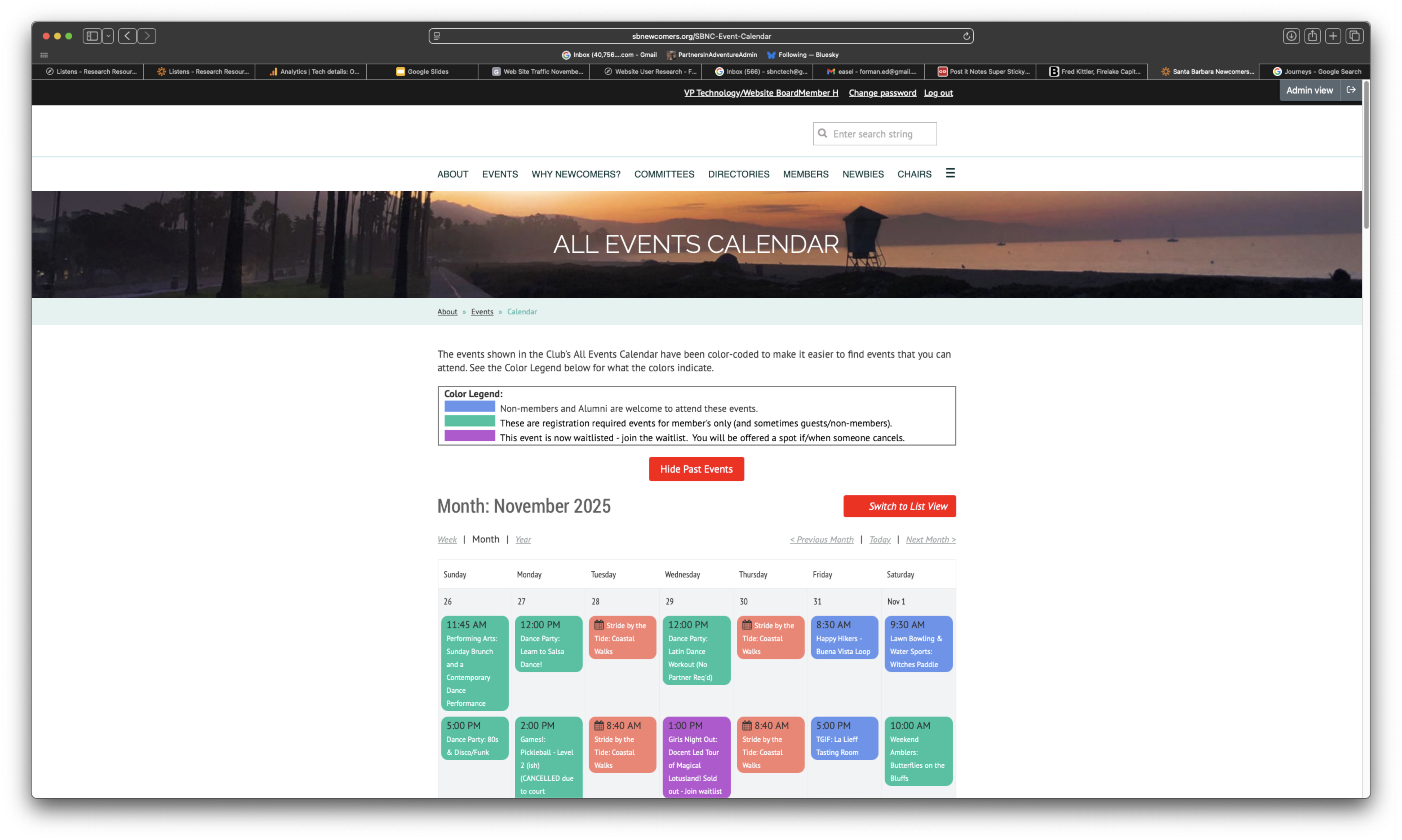
Profile: Moderate-high tech proficiency, works M-F 8-5

Main Goal: Quick event discovery that fits schedule

POV: Needs a way to quickly find and filter events by date/time because the current calendar navigation is cumbersome and time-consuming.

"I wish there were more events like during, like on the weekends or, you know, during the evening."

🤝 The Active Volunteer

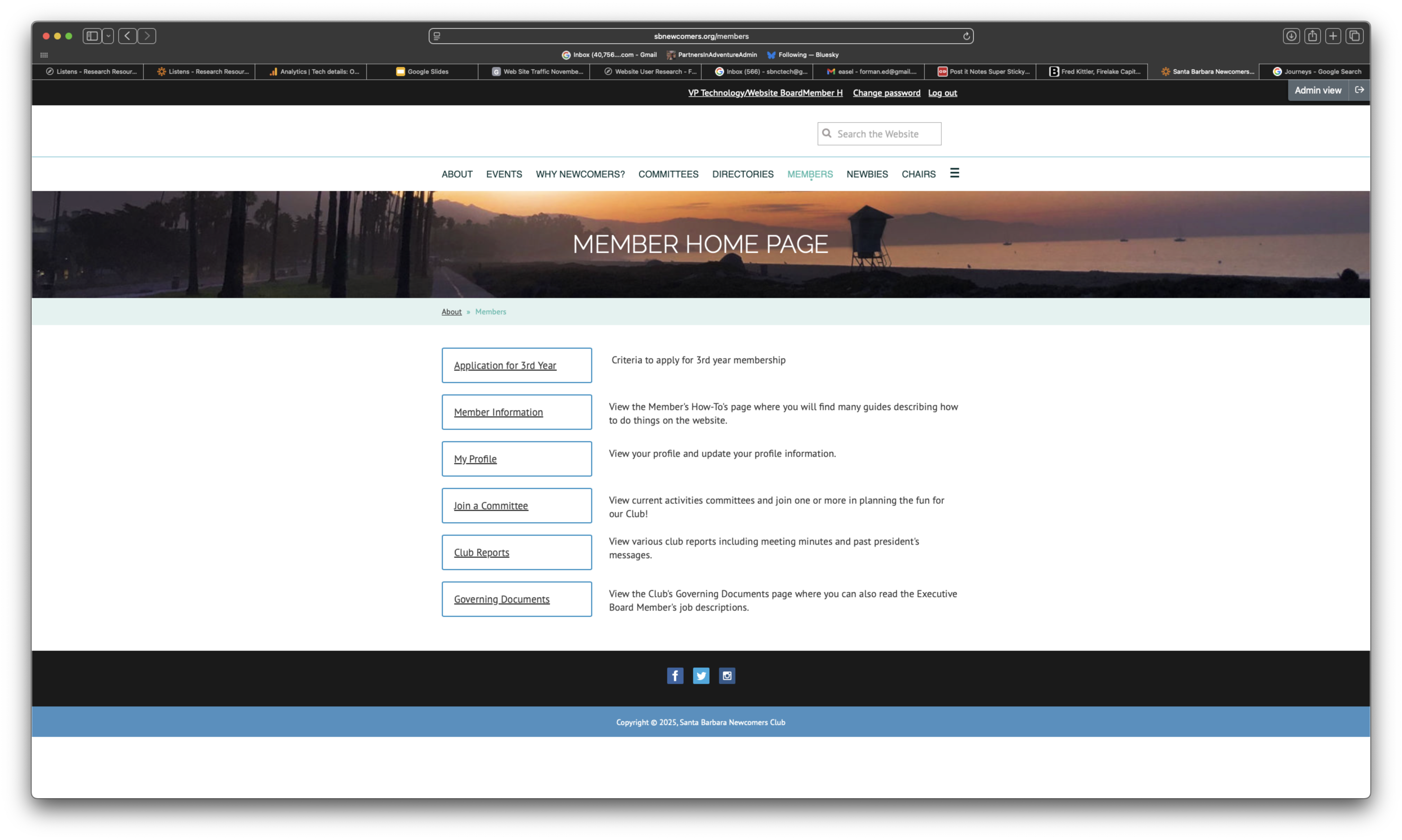
Profile: Low-moderate tech proficiency, committee chair

Main Goal: Simple navigation and event management

POV: Committee chairs need better training on event management because they struggle with system complexity, hindering successful events.

"If someone cancels and you go to the waitlist... that was extremely time-consuming."

🎯 The Participant Member

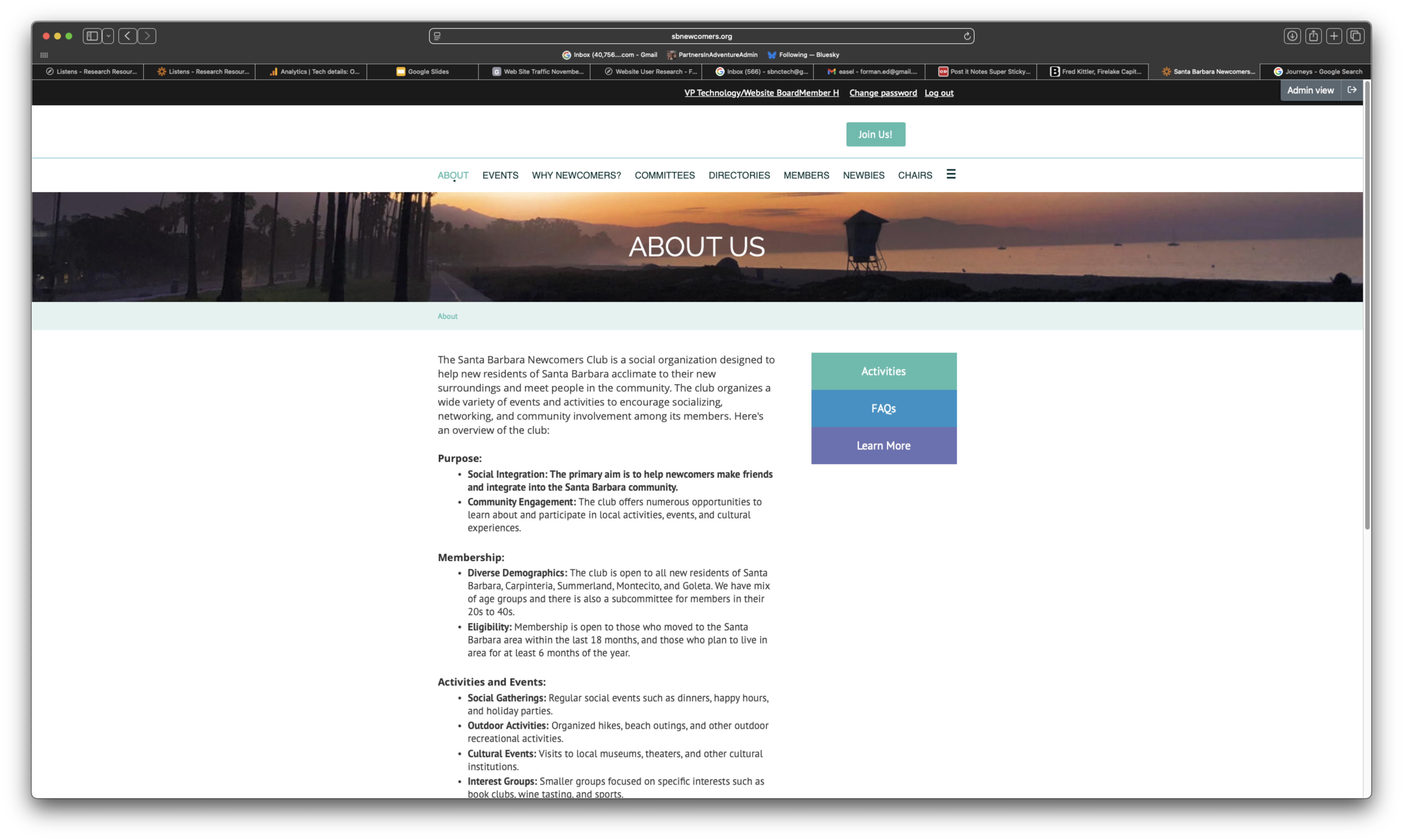
Profile: Joined to meet people and participate in social activities

Main Goal: Easy event browsing and registration

POV: Needs to easily see which events have openings because finding waitlisted events is frustrating and discourages participation.

"So I just go to the calendar a lot to see what events are coming up."

Lens 4.5: Jobs to be Done (JTBD)

38 Website-Related Jobs Across Four Categories

⚙️ Functional (17)

"When I want to find events..."

...I want to easily find events and their details, so I can choose which ones to participate in.

"When I need to register..."

...I want a seamless registration process, so I can participate without hassle.

❤️ Emotional (8)

"When I explore the website..."

...I want to feel excited and welcomed, so I can feel comfortable joining and participating.

"When I use the website..."

...I want to feel it represents a contemporary community, so I can feel proud to be a member.

👥 Social (4)

"When I participate in events..."

...I want to be perceived as an engaged and active member, so I can build my social reputation and positive connections.

🛠️ Supporting (9)

"When I need information..."

...I want it to be easily accessible, so I can make informed decisions about my participation.

"When I receive notifications..."

...I want them to be clear and actionable, so I can easily engage with the community.

Lens 5: Key Strategic Insights

Seven Strategic Insights (Top Five Highlighted)

1. Utility Over Aesthetics: Users prioritize function and efficiency - "I want to do my business and get out" - design must be simple and task-focused.

2. Clarity is Critical: Users value transparency in event information but find descriptions often unclear or conflicting.

3. Institutional Memory Gap: Lack of formalized knowledge transfer creates repeated learning curves for new committee members.

4. High Turnover Impact: Organization reinvents itself every 6 months - learning curve peaks at transition time.

5. Admin vs Regular Users: Different user privilege levels have vastly different experiences - design must accommodate both.

6. Technical Support Need: Demand for dedicated technical support role to assist with event management logistics.

7. Dual-Purpose Tools: Features like printed name tags serve identification AND audit functions - maximize value of each tool.
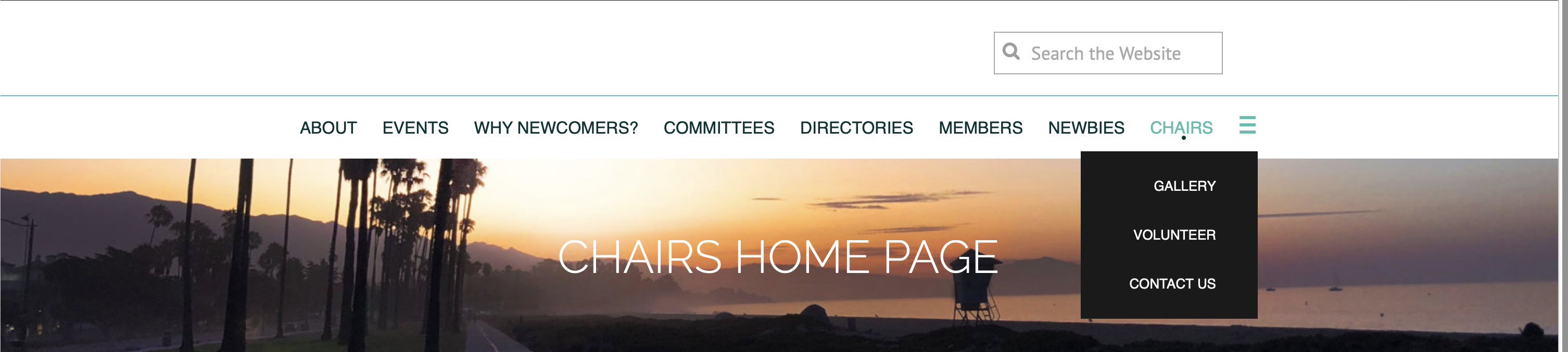
Lens 7: Poignant User Quotes (30 Verbatim)

Top Five Highlighted

"I don't want to be a member of an old person's club."
"It feels very dated. The website appears very dated."
"It would be helpful to know which events still have openings... most things I'm interested in, it says you have to be on the wait list."
"You click on something, and then you go back, and you're back at the top of the calendar."
"The most difficult thing, is that there's just so much, and it's overwhelming."
"If someone cancels and you go to the waitlist... that was extremely time-consuming."
"When there was something that I couldn't do, I couldn't figure out how to tell the committee chair."
"I have to page back a lot. I have to go back a lot more steps."
"Each time I want to go back to the calendar of events... it goes back to the beginning of like many months ago."
"I do find the calendaring part clunky. It seems antiquated."
"The app has a search bar, but on the website, it doesn't. You just have to scroll through the calendars."
"If you click it, it takes you to the committee page and then you have to go find the committee."
"I just want to hit cancel if it turns out I can't make something... I have to figure out who organized this event."
"The homepage looks like you're starting either a surfing club or a lifeguarding club."
"Too many words. It's way too much detail."
"I just find it to be really drab. The photography is boring. The fonts are boring. The colors are boring."
"We're getting a lot of emails... my email is just swamped with Santa Barbara newcomers club."
"It's redundant, repeating the same description of the committees."
"I'm looking for utility. I want to do my business and I want to get out."
"I feel very, very lucky when I find that button to join."
"I'm delighted to have so many opportunities in my calendar... not be sitting there being scared at home."
"I chose Santa Barbara based on criteria... high on that list was community."
"It's such a neat way to meet people. I'm just super impressed by it."
"I thought the signing up process was really quite easy. I didn't have any trouble at all."
"The job form is a nightmare for most."

Lens 6: User Journeys

Event Discovery & Registration

1. Discovery

Opens website → Overwhelmed → Struggles to find events

😟

2. Exploration

Opens calendar → No search → Scrolls manually through dates

😤

3. Evaluation

Clicks event → Loses calendar position → Unclear if spots available

😕

4. Registration

Tries to register → Can't find "Join" button → Success feels "lucky"

😅

5. Post-Registration

Cannot find "My Events" → Relies on email confirmations

😞

Critical Finding: Every stage has friction points that could be eliminated

Priority Pages to Improve (1 of 5)

1. Events/Calendar (CRITICAL)

Recommendation: Add search/filter, show event status (open/full/waitlist), preserve calendar position

Events Calendar

Priority Pages to Improve (2 of 5)

2. Member Dashboard (CRITICAL)

Recommendation: Display "My Registered Events" prominently, allow profile self-service

Member Dashboard

Priority Pages to Improve (3 of 5)

3. Homepage

Recommendation: Modern, inviting design; clear path to key actions; highlight featured events

Homepage

Priority Pages to Improve (4 of 5)

4. Committees/Groups Directory

Recommendation: Better organization, search/filter capabilities, clear "how to join"

Committees Directory

Priority Pages to Improve (5 of 5)

5. Main Navigation

Recommendation: Simplify menu structure, reduce backtracking, clearer labels

Main Navigation

Measuring Success

Key Performance Indicators

Usability Metrics

  • Reduce clicks to register for events
  • Increase website usage vs app
  • Faster event discovery time
  • Fewer support requests

User Satisfaction

  • Improved perception of modernity
  • Higher new member engagement
  • Positive user feedback
  • Increased self-service capability

Key Takeaways

Next Steps: Prioritize fixes based on impact and effort, implement in next 2 months

1 / 18